Vermontville Maple Syrup Festival Rebrand Project
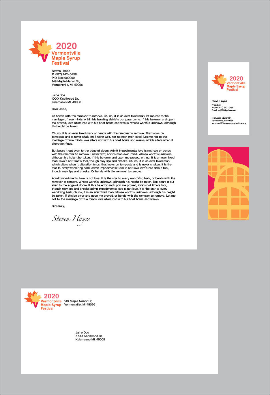
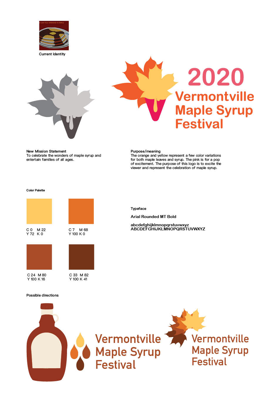
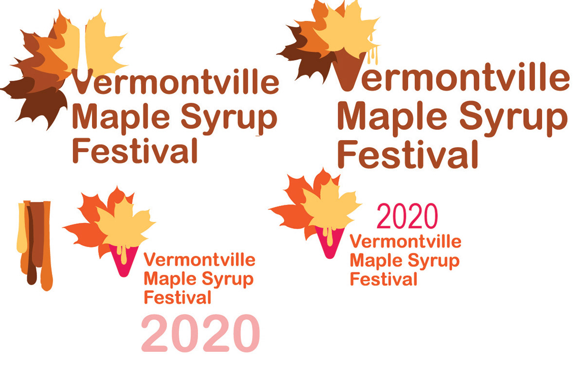
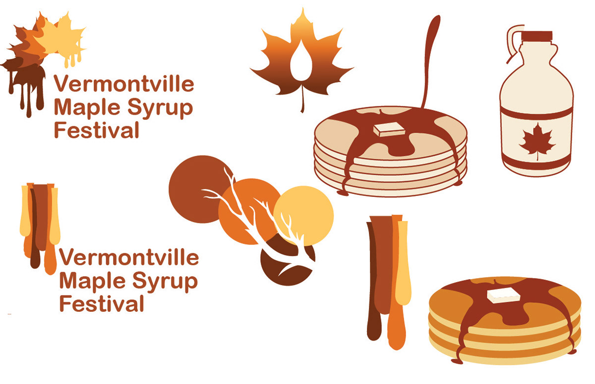
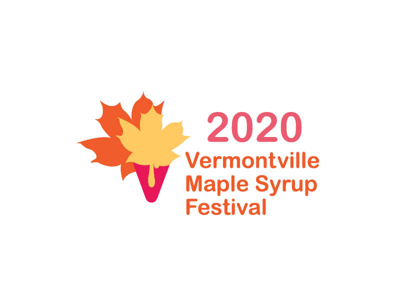
The Vermontville Maple Syrup Festival is one of Michigan's oldest maple syrup festivals and attracts visitors from across the region each year. My goal was to create a logo that reflected the festival's fun, family-friendly atmosphere. I used a warm palette of orange and yellow to represent the fall season, while shades of pink added a vibrant, energetic touch. Rounded sans-serif typography reinforces the welcoming, family-oriented feel and complements the playful visual identity.
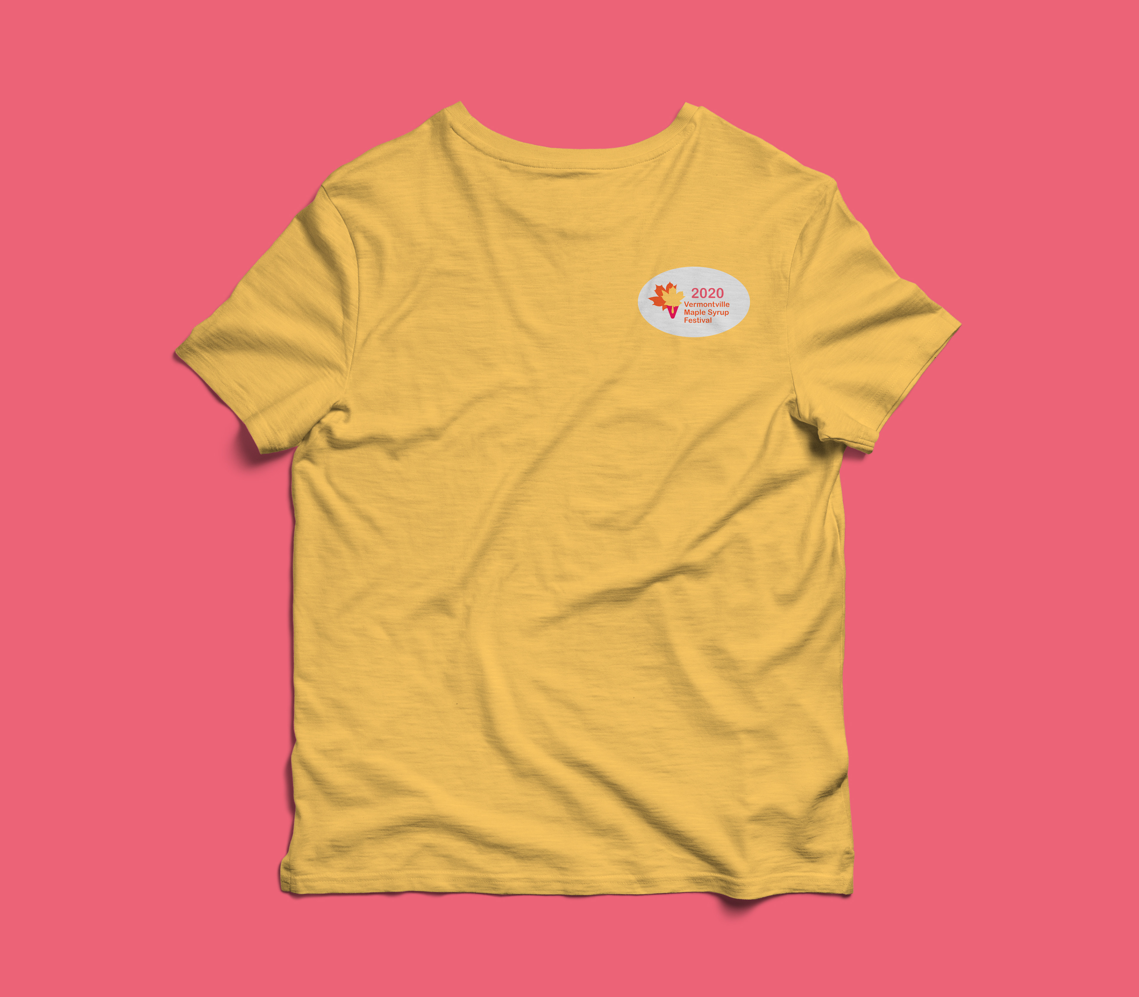
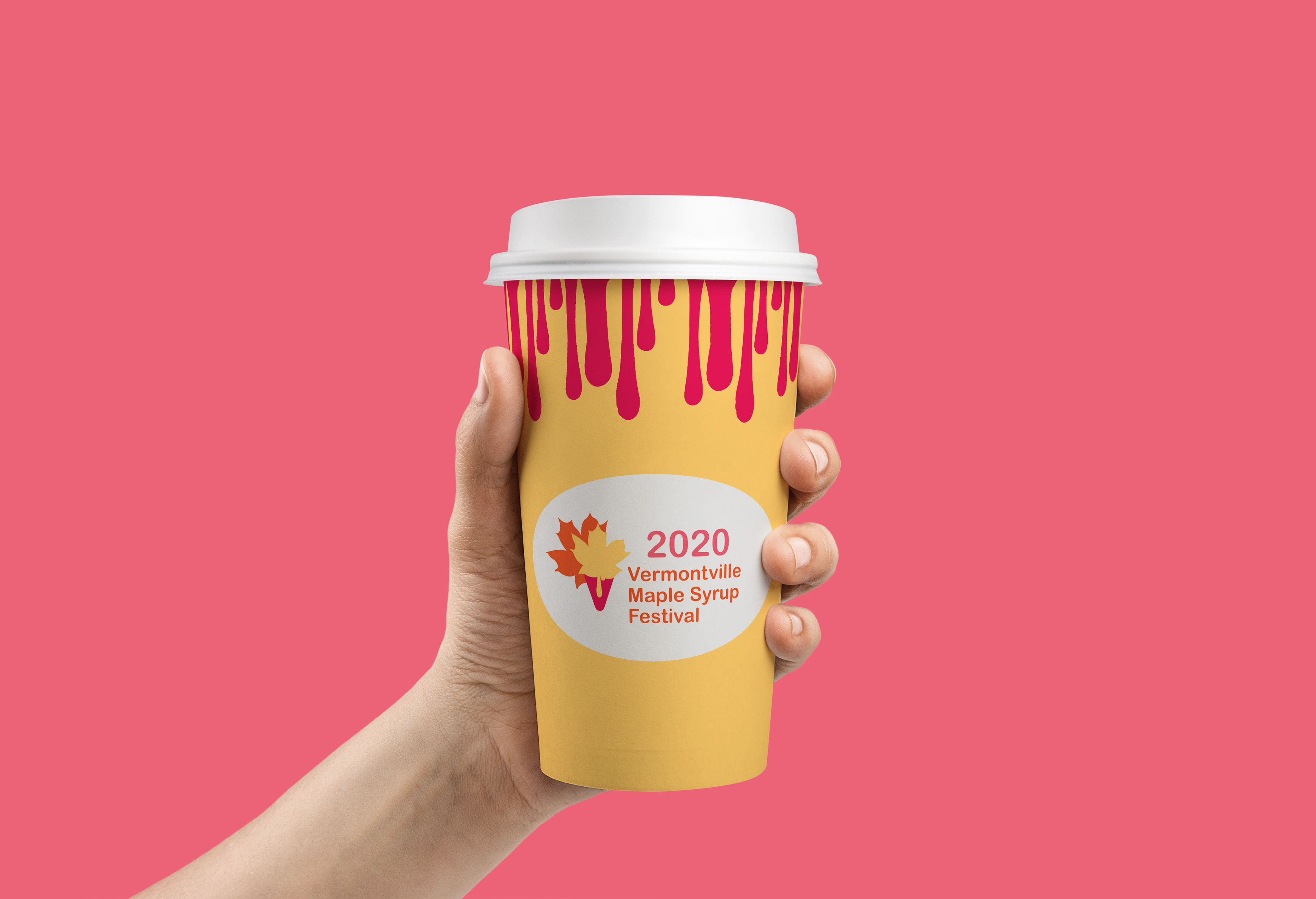
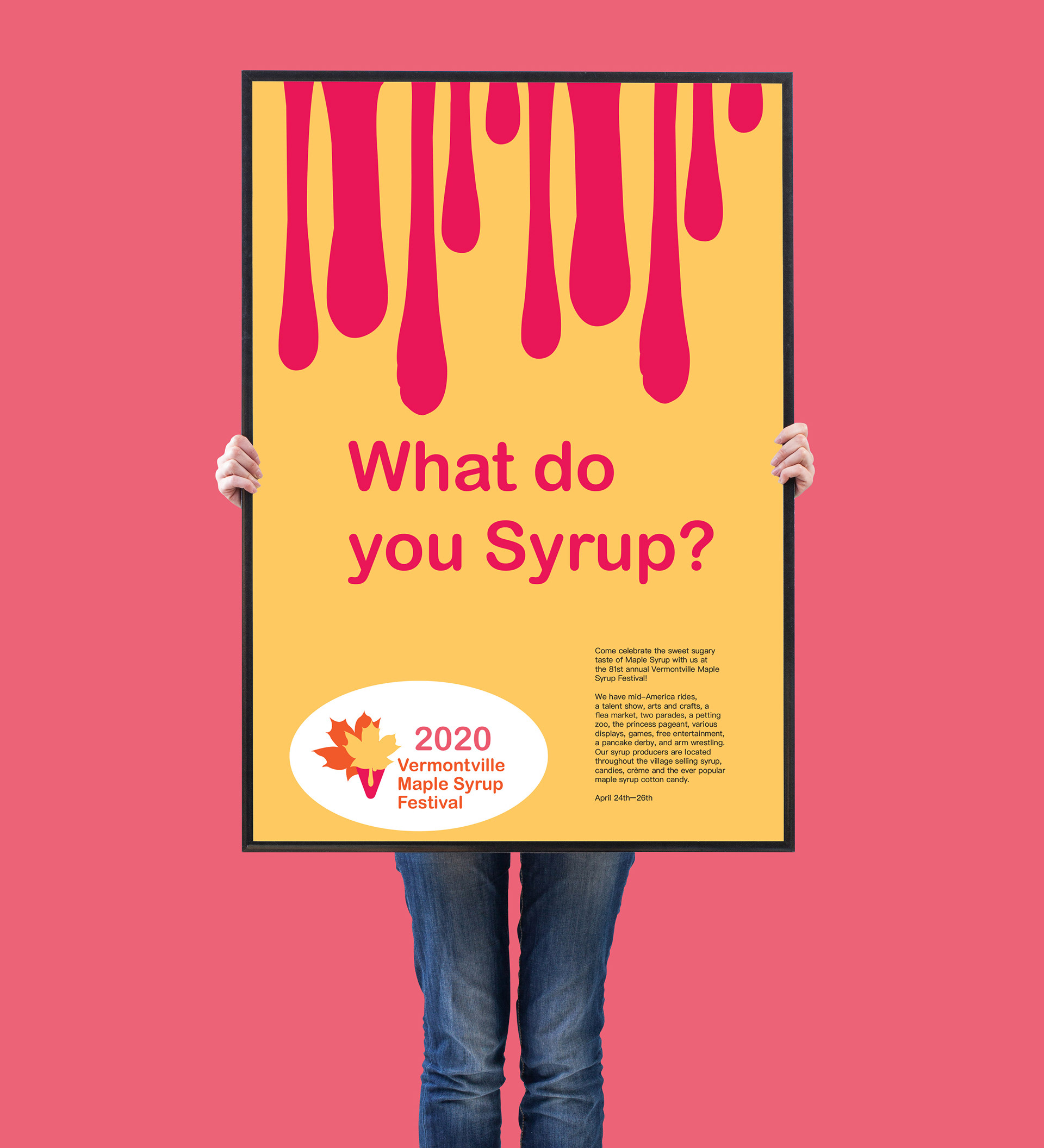
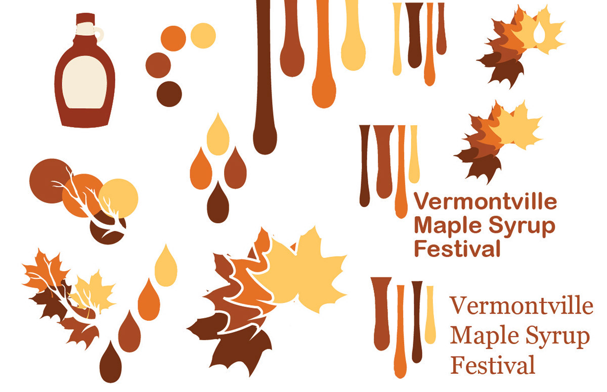
I wanted the festival staff to be easily recognizable, so I designed bright yellow T-shirts to help them stand out from the crowd. I carried that same bold color into the festival cup to create a cohesive visual identity and added flowing maple syrup drips to introduce a sense of movement. I applied the same color palette and dynamic design elements to the poster, creating an eye-catching composition that captures the fun and energetic spirit of the festival.